Hello House of Hackney
“We do not inherit the earth from our ancestors, we are borrowing it from our children.”
Frieda and Javvy. Even the names possess a kind of razzle dazzle, a magic, a bohemian rhythm. On a brisk December day last year, I was lucky enough to step inside the world of these two exquisite humans - the founders behind House of Hackney.
Do I even need to intro this brand? That’s a gorgeous story in itself, but just in case, here’s a condensed version… Frieda and Javvy are the founders of luxury British design house, House of Hackney. Their business offers a whimsical array of wallpapers, fabric, furnishings, home accessories, fashion and expert advice, and their entire MO is wrapped-up in a cool concept; “Our House is your Home”. HOH believe a home is somewhere to call your own, a space to create and decorate your own way… to go with what you love and live with what you love. There are no rules.

Quite literally that makes my soul sing.
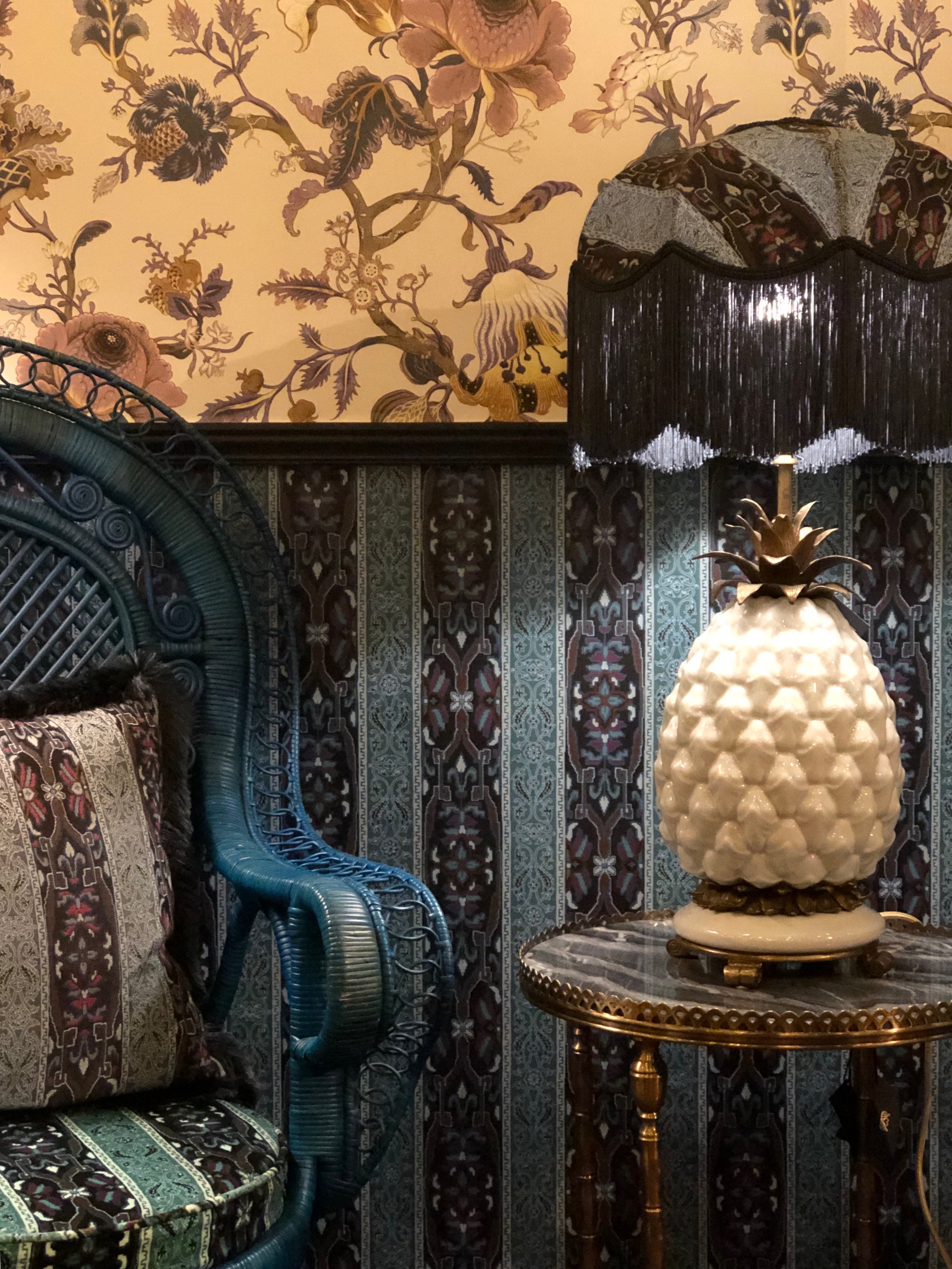
The flagship store is in Shoreditch, London. After a tube ride and a chilly walk I was rewarded with something best described as having my heart hugged. The footprint bursts with personality - I think Frieda and Javvy are my kind of people. Their ability to pull nature into their interiors is inspirational, and their love of botanicals spoke to me on every level.
I met with Steve, their in-house interiors consultant, he showed me current ranges, we chatted about the ongoing vision of HOH and shared much laughter. If he reflects the brand, they’ve got their family right. What I love is that behind the exceptional products is a business built on strong foundations:
• Creativity with purpose
• Integrity in our actions
• Compassion for our planet and its people
If we could all live by these statements…


For every roll of wallpaper sold, HOH pledges to plant one tree. What people may not realise is that behind many of their designs is a bold message, often highlighting the plight of endangered animals. It’s very powerful. Other collections resemble the world around us; nature, music, cinema, travel and the cultural melting pot of London.
When creating HOH, Frieda and Javvy wanted to bring wallpaper to a new audience and they drew on William Morris for influence. Mr Morris is a celebrated British textile designer, poet, novelist, translator and socialist activist associated with the British Arts and Crafts Movement. Their values were in sync, along with mutual respect for beautiful design and a social conscience. HOH are privileged to tap into his spectacular archives and bring his works to life.
How can you inject a little House of Hackney?
First, let’s appreciate the wise words from William Morris; “Have nothing in your home that you don’t know to be useful or believe to be beautiful.” I could probably stop right there.
The other thing to keep in mind is that HOH encourage a NO RULES philosophy. I follow a similar sentiment at Stylemaker. I’ve never been gripped by latest fashion or trends - that makes me squirm. But that doesn’t mean I’ve thrown out all guidelines. Pattern evokes huge emotion and if done wrong, it can feel awkward and look awful.
There are tricks for communicating through pattern, it’s a bit like sharing through words. The trick is to think about contrast, among a few other hacks:
Patterns must contrast enough to set them apart, yet they should have something in common.
Too much contrast and the patterns can’t live together, they have nothing akin (think shape, colour or texture to guide you).
Too little contrast and you just confuse the eye - we don’t know where to focus or what to think.
Make sure the patterns have at least one (but not too many) shared characteristics.
The old thinking of keeping it to 3 patterns is dead. Oh god, it used to be one large, one medium and one small, what nonsense. Trust your instincts – you’ll know when it’s too OTT.
Want your room to appear smaller? Go big and bold with the pattern to soak up the space.
The more patterned an item the heavier it looks.
How do you want to feel in a room? More pattern - the louder the noise.
Want to make a statement, send a message? Pick bold front and centre patterns.
Lucky enough to have a 3m stud? Consider pattern on the ceiling.
Do it like Frieda & Javvy - ditch the rulebook, relax and have fun.

